> ## Documentation Index
> Fetch the complete documentation index at: https://docs.stigg.io/llms.txt
> Use this file to discover all available pages before exploring further.
# Pricing table
## Overview
Pricing tables allow your customers to select the plan that that they'd like to subscribe to. Pricing tables can be used on your public pricing page, as well as part of in-app paywalls.
One of the major benefits of leverage Stigg's pricing table widget, is that any change that you make to your pricing model is auto-magically reflected in the pricing table - no additional coding is required 😎.
## Pricing table layout
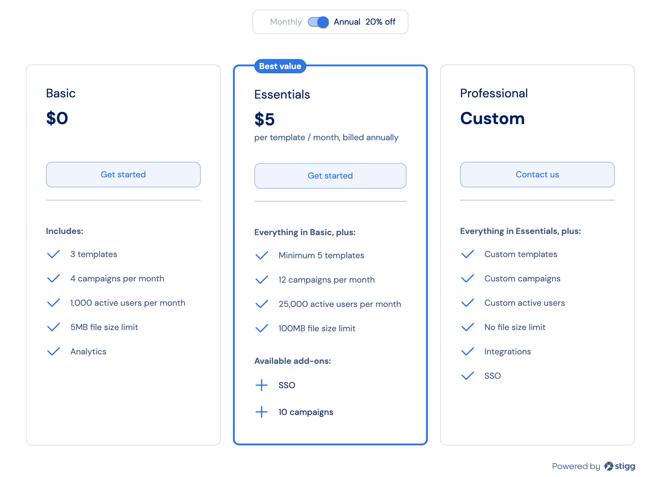
Pricing tables includes cards that represent each plan that customres can subscribe to.
Each plan includes the following details:
1. **Plan name**
2. **CTA button** to allow users to select the plan.
3. **Price**
4. **Entitlements** that the customer will get access to when subscribing to the plan. Entitlement [visibility](/documentation/modeling-your-pricing-in-stigg/plans/assigning-features-plans#controlling-entitlement-visibility), [order](/documentation/modeling-your-pricing-in-stigg/plans/assigning-features-plans#defining-entitlement-order) and [display text](/documentation/modeling-your-pricing-in-stigg/plans/assigning-features-plans#customizing-entitlement-display-text) can be defined at the plan level.
5. **Available add-ons** - available add-ons are defined according to the list of add-ons that are [compatible with the plan](/documentation/modeling-your-pricing-in-stigg/add-ons/defining-compatibility). [Add-on visibility](/documentation/modeling-your-pricing-in-stigg/add-ons/controlling-add-on-visibility) is defined at the add-on level.
 When integrating Stigg widgets into your application, it's highly recommended to [enable client-side security enforcement](/api-and-sdks/integration/frontend/hardening-client-side-access), especially in production environments.
## Rendering pricing tables
### In public pricing pages
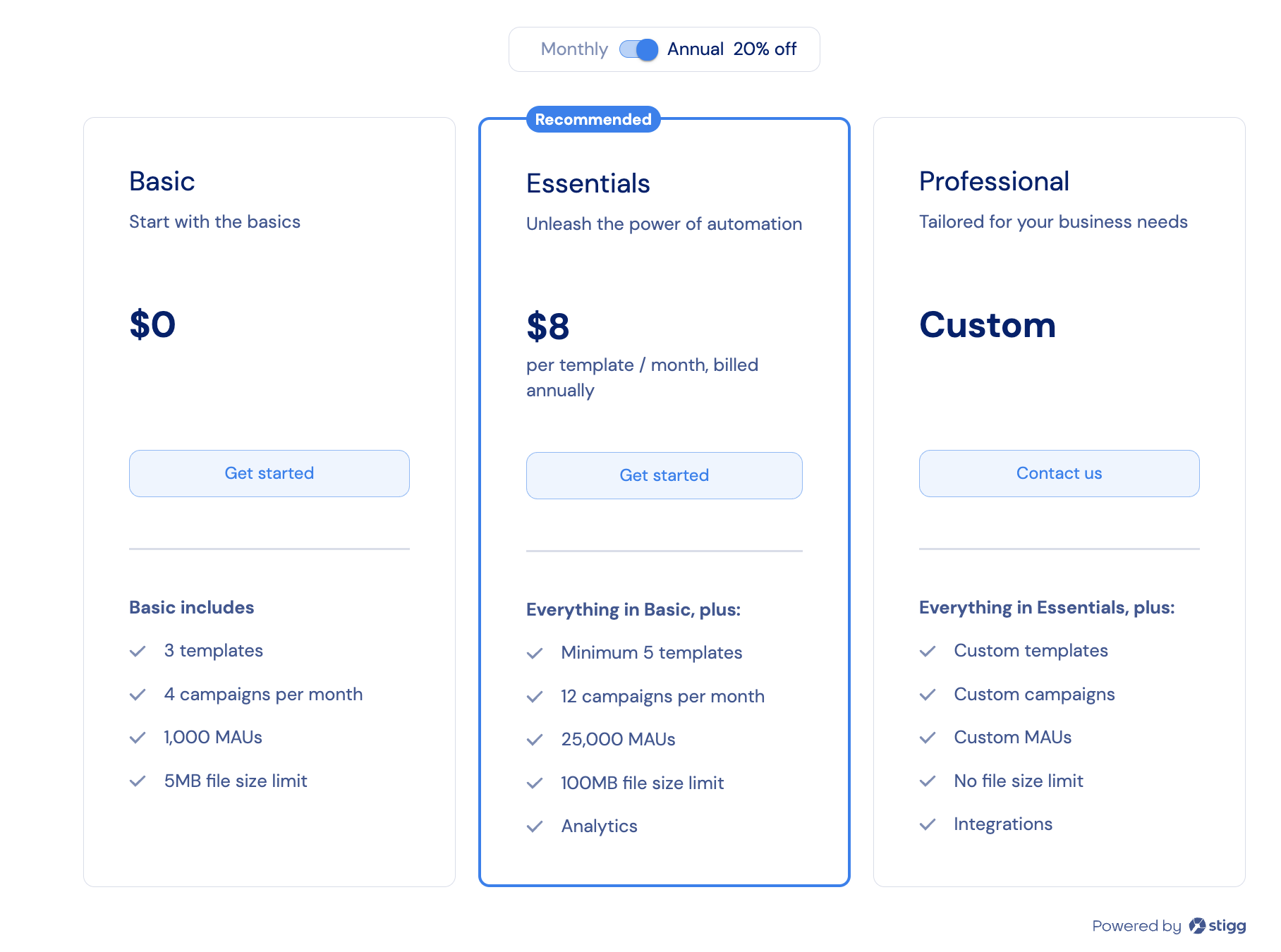
Rendering Stigg's pricing table widget on your public pricing page allows you to present the available pricing to your website's visitors.
You can leverage the [product's customer journey](../modeling-your-pricing-in-stigg/products/defining-customer-journey) configuration to control what plan the customer will be provisioned a subscription for once they click on **Get started**.
When integrating Stigg widgets into your application, it's highly recommended to [enable client-side security enforcement](/api-and-sdks/integration/frontend/hardening-client-side-access), especially in production environments.
## Rendering pricing tables
### In public pricing pages
Rendering Stigg's pricing table widget on your public pricing page allows you to present the available pricing to your website's visitors.
You can leverage the [product's customer journey](../modeling-your-pricing-in-stigg/products/defining-customer-journey) configuration to control what plan the customer will be provisioned a subscription for once they click on **Get started**.
 ```typescript React theme={null}
{
switch(intentionType) {
case SubscribeIntentionType.START_TRIAL:
// TODO: provision trial subscription
break;
case SubscribeIntentionType.REQUEST_CUSTOM_PLAN_ACCESS:
// TODO: redirect to contact us form
break;
case SubscribeIntentionType.UPGRADE_PLAN:
case SubscribeIntentionType.DOWNGRADE_PLAN:
// TODO: show checkout experience
break;
}
}}
/>
```
```typescript Vue.js theme={null}
```
```html html theme={null}
```
### In-app paywalls
To render paywalls inside your application, when a customer signs-in or restores their session set the customer ID:
```typescript React theme={null}
import { StiggProvider } from '@stigg/react-sdk';
export function App() {
return (
);
}
```
```typescript Vue.js theme={null}
```
#### Downgrades and upgrades
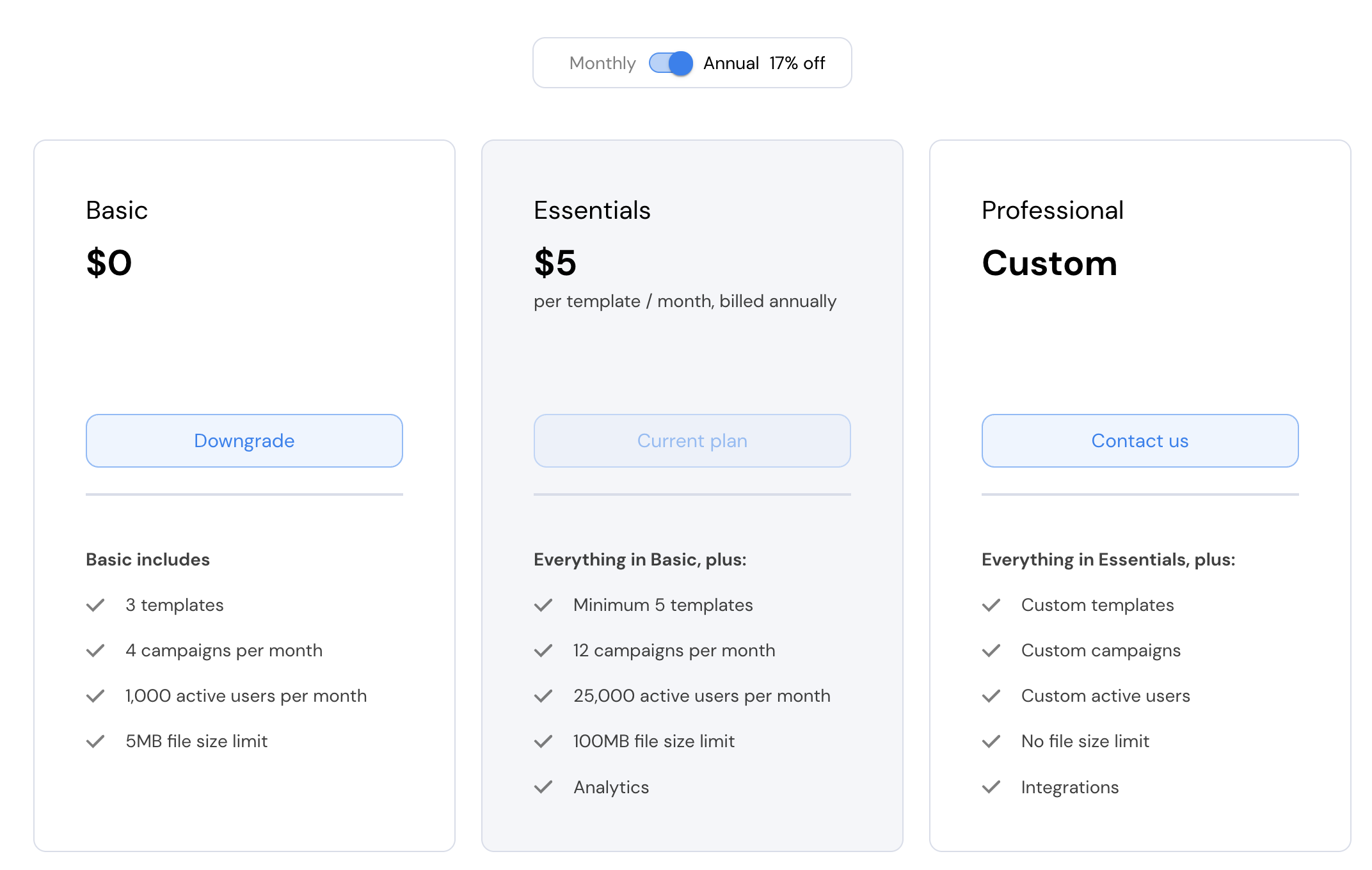
Users that are logged in to the application can view the current plan that they're subscribed to, as well as downgrade and upgrade options.
```typescript React theme={null}
{
switch(intentionType) {
case SubscribeIntentionType.START_TRIAL:
// TODO: provision trial subscription
break;
case SubscribeIntentionType.REQUEST_CUSTOM_PLAN_ACCESS:
// TODO: redirect to contact us form
break;
case SubscribeIntentionType.UPGRADE_PLAN:
case SubscribeIntentionType.DOWNGRADE_PLAN:
// TODO: show checkout experience
break;
}
}}
/>
```
```typescript Vue.js theme={null}
```
```html html theme={null}
```
### In-app paywalls
To render paywalls inside your application, when a customer signs-in or restores their session set the customer ID:
```typescript React theme={null}
import { StiggProvider } from '@stigg/react-sdk';
export function App() {
return (
);
}
```
```typescript Vue.js theme={null}
```
#### Downgrades and upgrades
Users that are logged in to the application can view the current plan that they're subscribed to, as well as downgrade and upgrade options.
 ```typescript React theme={null}
{
switch(intentionType) {
case SubscribeIntentionType.START_TRIAL:
// TODO: provision trial subscription
break;
case SubscribeIntentionType.REQUEST_CUSTOM_PLAN_ACCESS:
// TODO: redirect to contact us form
break;
case SubscribeIntentionType.CHANGE_UNIT_QUANTITY:
case SubscribeIntentionType.UPGRADE_PLAN:
case SubscribeIntentionType.DOWNGRADE_PLAN:
// TODO: show checkout experience
break;
case SubscribeIntentionType.CANCEL_SCHEDULED_UPDATES:
// TODO: show confirmation dialog
// once confirmed, cancel the scheduled subscription update
break;
}
}}
/>
```
```typescript Vue.js theme={null}
```
#### Upgrade only
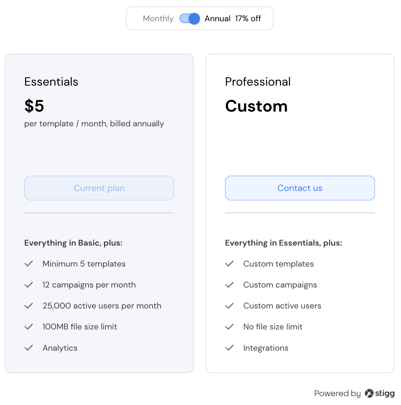
It's also possible to only present the upgrade options (and hide lower tier/free plans); thereby, encouraging customers to upsell:
```typescript React theme={null}
{
switch(intentionType) {
case SubscribeIntentionType.START_TRIAL:
// TODO: provision trial subscription
break;
case SubscribeIntentionType.REQUEST_CUSTOM_PLAN_ACCESS:
// TODO: redirect to contact us form
break;
case SubscribeIntentionType.CHANGE_UNIT_QUANTITY:
case SubscribeIntentionType.UPGRADE_PLAN:
case SubscribeIntentionType.DOWNGRADE_PLAN:
// TODO: show checkout experience
break;
case SubscribeIntentionType.CANCEL_SCHEDULED_UPDATES:
// TODO: show confirmation dialog
// once confirmed, cancel the scheduled subscription update
break;
}
}}
/>
```
```typescript Vue.js theme={null}
```
#### Upgrade only
It's also possible to only present the upgrade options (and hide lower tier/free plans); thereby, encouraging customers to upsell:
 ```typescript React theme={null}
{
switch(intentionType) {
case SubscribeIntentionType.START_TRIAL:
// TODO: provision trial subscription
break;
case SubscribeIntentionType.REQUEST_CUSTOM_PLAN_ACCESS:
// TODO: redirect to contact us form
break;
case SubscribeIntentionType.CHANGE_UNIT_QUANTITY:
case SubscribeIntentionType.UPGRADE_PLAN:
case SubscribeIntentionType.DOWNGRADE_PLAN:
// TODO: show checkout experience
break;
case SubscribeIntentionType.CANCEL_SCHEDULED_UPDATES:
// TODO: show confirmation dialog
// once confirmed, cancel the scheduled subscription update
break;
}
}}
/>
```
```typescript Vue.js theme={null}
```
#### Tiered and volume pricing
When [tiered](../modeling-your-pricing-in-stigg/plans/defining-plan-pricing/paid/charges/usage-based) and [volume](../modeling-your-pricing-in-stigg/plans/defining-plan-pricing/paid/charges/usage-based) pricing is defined, this is automatically reflected in the Stigg pricing table widget with a numeric up-down picker where customers can choose their desired unit quantity:
```typescript React theme={null}
{
switch(intentionType) {
case SubscribeIntentionType.START_TRIAL:
// TODO: provision trial subscription
break;
case SubscribeIntentionType.REQUEST_CUSTOM_PLAN_ACCESS:
// TODO: redirect to contact us form
break;
case SubscribeIntentionType.CHANGE_UNIT_QUANTITY:
case SubscribeIntentionType.UPGRADE_PLAN:
case SubscribeIntentionType.DOWNGRADE_PLAN:
// TODO: show checkout experience
break;
case SubscribeIntentionType.CANCEL_SCHEDULED_UPDATES:
// TODO: show confirmation dialog
// once confirmed, cancel the scheduled subscription update
break;
}
}}
/>
```
```typescript Vue.js theme={null}
```
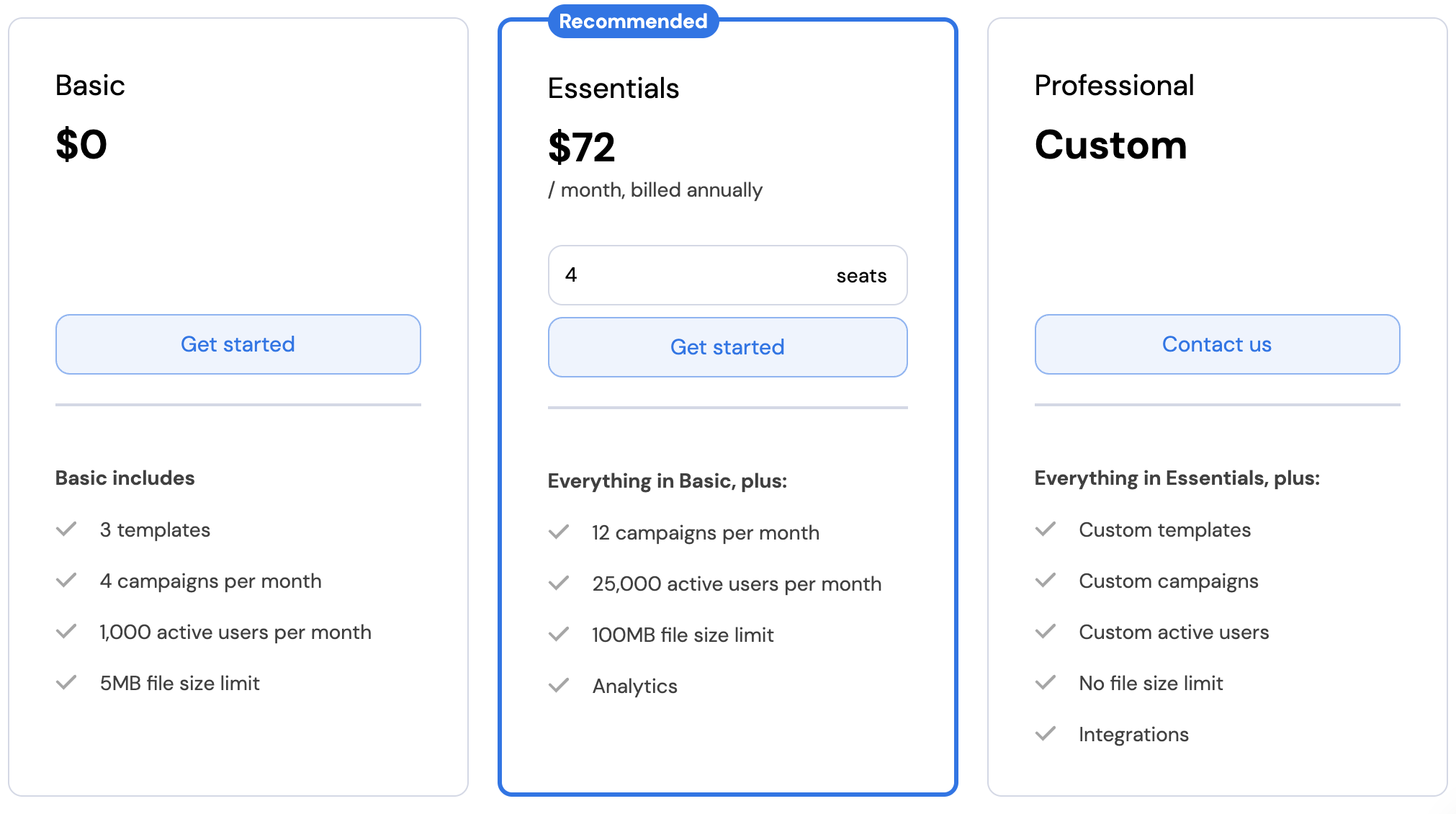
#### Tiered and volume pricing
When [tiered](../modeling-your-pricing-in-stigg/plans/defining-plan-pricing/paid/charges/usage-based) and [volume](../modeling-your-pricing-in-stigg/plans/defining-plan-pricing/paid/charges/usage-based) pricing is defined, this is automatically reflected in the Stigg pricing table widget with a numeric up-down picker where customers can choose their desired unit quantity:
 #### Stair-step pricing
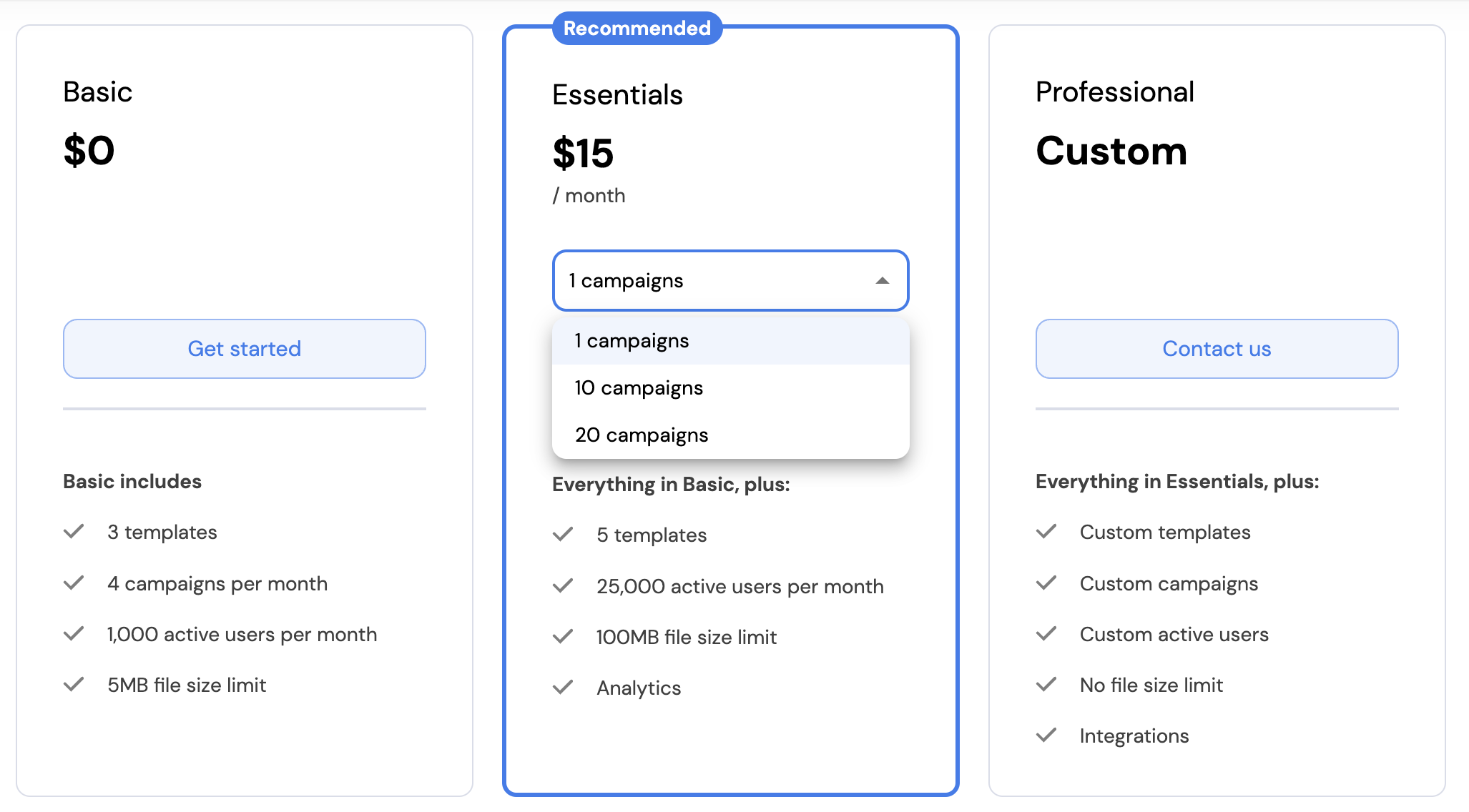
When [stair-step](../modeling-your-pricing-in-stigg/plans/defining-plan-pricing/paid/charges/usage-based) pricing is defined, this is automatically reflected in the Stigg pricing table widget with a drop-down where customers can choose their desired tier:
#### Stair-step pricing
When [stair-step](../modeling-your-pricing-in-stigg/plans/defining-plan-pricing/paid/charges/usage-based) pricing is defined, this is automatically reflected in the Stigg pricing table widget with a drop-down where customers can choose their desired tier:
 ## Customization
### No-code widget designer
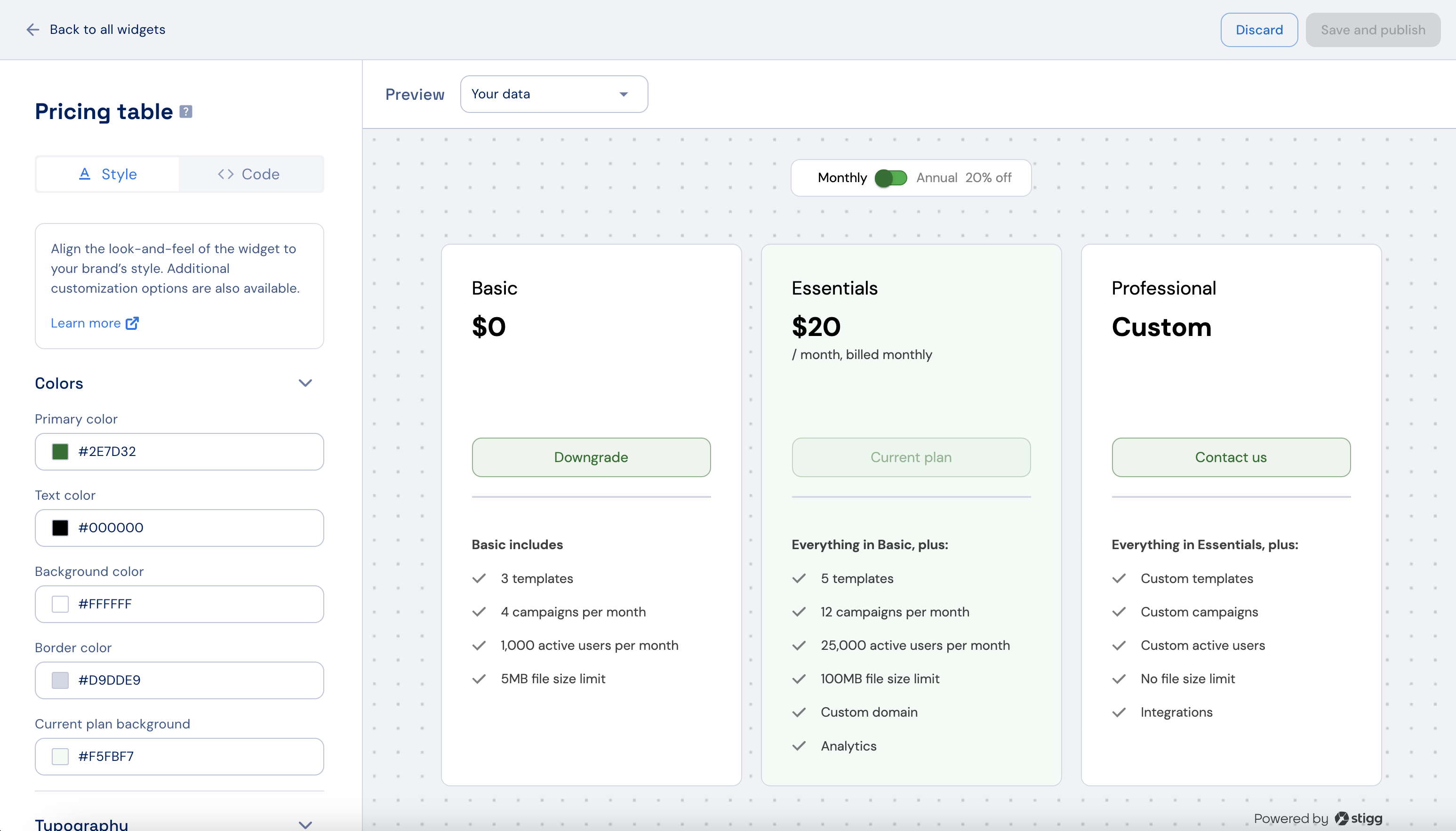
The Stigg app offers a no-code widget designer, which allows you to control the widget colors, typography and layout.
## Customization
### No-code widget designer
The Stigg app offers a no-code widget designer, which allows you to control the widget colors, typography and layout.
 ### Custom CSS
For more advanced customization, custom CSS can be applied using the widget designer of the Stigg app. Alternatively, custom CSS can also be applied using code.
Below you can find a list of the supported CSS classes:
#### General layout
| Class name | Description |
| -------------------------- | ----------------------------------------------- |
| stigg-paywall-layout | Styles applied to the entire paywall page |
| stigg-paywall-plans-layout | Styles applied to the container of all plans |
| stigg-starting-at-text | Styles applied to the plan price starts at text |
#### Billing period switcher
| Class name | Description |
| ----------------------------- | ----------------------------------------------------------- |
| stigg-period-picker-container | Styles applied to the period toggle section |
| stigg-period-switch | Styles applied to the period switch button |
| stigg-monthly-period-text | Styles applied to the monthly period text |
| stigg-annual-period-text | Styles applied to the annual period text |
| stigg-discount-rate-text | Styles applied to the discount rate given to annual billing |
#### Plan card
| Class name | Description |
| -------------------------------- | ------------------------------------------------------------------------------------- |
| stigg-plan-offering-container | Styles applied to the plan container |
| stigg-header-wrapper | Styles applied to the plan header section |
| stigg-plan-header | Styles applied to the title of the plan |
| stigg-price-text | Styles applied to the price of the plan |
| stigg-plan-description | Styles applied to the description of the plan |
| stigg-price-billing-period-text | Styles applied to the text stating the billing period of the plan |
| stigg-plan-header-divider | Styles applied to the divider between the header section and entitlements section |
| stigg-paywall-plan-button-layout | Styles applied to the button section |
| stigg-paywall-plan-button | Styles applied to the button of the plan |
| stigg-paywall-plan-button-text | Styles applied to the text of the button |
| stigg-highlight-badge | Styles applied to the recommended plan badge |
| stigg-highlight-badge-text | Styles applied to the recommended plan badge text |
| stigg-trial-days-left-text | Styles applied to the text describing how many days are left of the plan's free trial |
| stigg-`{plan.id}` | Styles applied to specific plans according to their unique ID |
#### Plan entitlements
| Class name | Description |
| ---------------------------------------- | ------------------------------------------------------------------------- |
| stigg-plan-entitlements-container | Styles applied to the entire section |
| stigg-plan-entitlements-title | Styles applied to the title of the section |
| stigg-entitlement-row-container | Styles applied to the area of each entitlement |
| stigg-entitlement-name | Styles applied to the text of each entitlement |
| stigg-entitlement-row-icon | Styles applied to the icon of each entitlement |
| stigg-entitlement-feature-`{feature.id}` | Styles applied to a specific entitlement row using its feature ID (slug). |
`{feature.id}` is the feature’s slug (lowercase; spaces and special characters become `-`).\
This class is added **in addition to** `stigg-entitlement-row-container`, so you can safely target one entitlement without affecting others.\
Mirrors the existing patterns: `stigg-{plan.id}` (plan) and `stigg-compatible-addon-{addon.id}` (add-on).
#### Plan add-ons
| Class name | Description |
| ---------------------------------- | ----------------------------------------------------------- |
| stigg-compatible-addons-container | Styles applied to the entire section |
| stigg-compatible-addons-header | Styles applied to the title of the section |
| stigg-compatible-addons-list | Styles applied to the add-on list |
| stigg-compatible-addon-item | Styles applied to every row in the add-on list |
| stigg-compatible-addon-\{addon.id} | Styles applied to a specific add-on row using its add-on ID |
| stigg-compatible-addon-icon | Styles applied to the icon of each add-on |
| stigg-compatible-addon-content | A wrapper around the add-on name |
| stigg-compatible-addon-name | Styles applied to the add-on name |
### Texts
The default widget texts can currently be overridden using code:
```javascript React theme={null}
const textOverrides = {
highlightChip: 'Best value',
planCTAButton: {
startTrial: (plan: Plan) => `Start trial (${plan.defaultTrialConfig.duration} days)`,
upgrade: 'Start now',
custom: 'Contact us',
switchToBillingPeriod: billingPeriod => `Switch to ${billingPeriod.toLowerCase()}`,
cancelScheduledUpdate: 'Cancel update',
},
price: {
custom: 'Contact us',
},
}
{
...
}}
textOverrides={textOverrides}
/>
```
You can find additional text override options [here](https://react-sdk-docs.stigg.io/types/paywalllocalization)
## Additional resources
## Related SDKs
### Custom CSS
For more advanced customization, custom CSS can be applied using the widget designer of the Stigg app. Alternatively, custom CSS can also be applied using code.
Below you can find a list of the supported CSS classes:
#### General layout
| Class name | Description |
| -------------------------- | ----------------------------------------------- |
| stigg-paywall-layout | Styles applied to the entire paywall page |
| stigg-paywall-plans-layout | Styles applied to the container of all plans |
| stigg-starting-at-text | Styles applied to the plan price starts at text |
#### Billing period switcher
| Class name | Description |
| ----------------------------- | ----------------------------------------------------------- |
| stigg-period-picker-container | Styles applied to the period toggle section |
| stigg-period-switch | Styles applied to the period switch button |
| stigg-monthly-period-text | Styles applied to the monthly period text |
| stigg-annual-period-text | Styles applied to the annual period text |
| stigg-discount-rate-text | Styles applied to the discount rate given to annual billing |
#### Plan card
| Class name | Description |
| -------------------------------- | ------------------------------------------------------------------------------------- |
| stigg-plan-offering-container | Styles applied to the plan container |
| stigg-header-wrapper | Styles applied to the plan header section |
| stigg-plan-header | Styles applied to the title of the plan |
| stigg-price-text | Styles applied to the price of the plan |
| stigg-plan-description | Styles applied to the description of the plan |
| stigg-price-billing-period-text | Styles applied to the text stating the billing period of the plan |
| stigg-plan-header-divider | Styles applied to the divider between the header section and entitlements section |
| stigg-paywall-plan-button-layout | Styles applied to the button section |
| stigg-paywall-plan-button | Styles applied to the button of the plan |
| stigg-paywall-plan-button-text | Styles applied to the text of the button |
| stigg-highlight-badge | Styles applied to the recommended plan badge |
| stigg-highlight-badge-text | Styles applied to the recommended plan badge text |
| stigg-trial-days-left-text | Styles applied to the text describing how many days are left of the plan's free trial |
| stigg-`{plan.id}` | Styles applied to specific plans according to their unique ID |
#### Plan entitlements
| Class name | Description |
| ---------------------------------------- | ------------------------------------------------------------------------- |
| stigg-plan-entitlements-container | Styles applied to the entire section |
| stigg-plan-entitlements-title | Styles applied to the title of the section |
| stigg-entitlement-row-container | Styles applied to the area of each entitlement |
| stigg-entitlement-name | Styles applied to the text of each entitlement |
| stigg-entitlement-row-icon | Styles applied to the icon of each entitlement |
| stigg-entitlement-feature-`{feature.id}` | Styles applied to a specific entitlement row using its feature ID (slug). |
`{feature.id}` is the feature’s slug (lowercase; spaces and special characters become `-`).\
This class is added **in addition to** `stigg-entitlement-row-container`, so you can safely target one entitlement without affecting others.\
Mirrors the existing patterns: `stigg-{plan.id}` (plan) and `stigg-compatible-addon-{addon.id}` (add-on).
#### Plan add-ons
| Class name | Description |
| ---------------------------------- | ----------------------------------------------------------- |
| stigg-compatible-addons-container | Styles applied to the entire section |
| stigg-compatible-addons-header | Styles applied to the title of the section |
| stigg-compatible-addons-list | Styles applied to the add-on list |
| stigg-compatible-addon-item | Styles applied to every row in the add-on list |
| stigg-compatible-addon-\{addon.id} | Styles applied to a specific add-on row using its add-on ID |
| stigg-compatible-addon-icon | Styles applied to the icon of each add-on |
| stigg-compatible-addon-content | A wrapper around the add-on name |
| stigg-compatible-addon-name | Styles applied to the add-on name |
### Texts
The default widget texts can currently be overridden using code:
```javascript React theme={null}
const textOverrides = {
highlightChip: 'Best value',
planCTAButton: {
startTrial: (plan: Plan) => `Start trial (${plan.defaultTrialConfig.duration} days)`,
upgrade: 'Start now',
custom: 'Contact us',
switchToBillingPeriod: billingPeriod => `Switch to ${billingPeriod.toLowerCase()}`,
cancelScheduledUpdate: 'Cancel update',
},
price: {
custom: 'Contact us',
},
}
{
...
}}
textOverrides={textOverrides}
/>
```
You can find additional text override options [here](https://react-sdk-docs.stigg.io/types/paywalllocalization)
## Additional resources
## Related SDKs
 React
React
 Vue.js
 Next.js
 Webflow, Wordpress, HTML