> ## Documentation Index
> Fetch the complete documentation index at: https://docs.stigg.io/llms.txt
> Use this file to discover all available pages before exploring further.
# Customer portal
## Overview
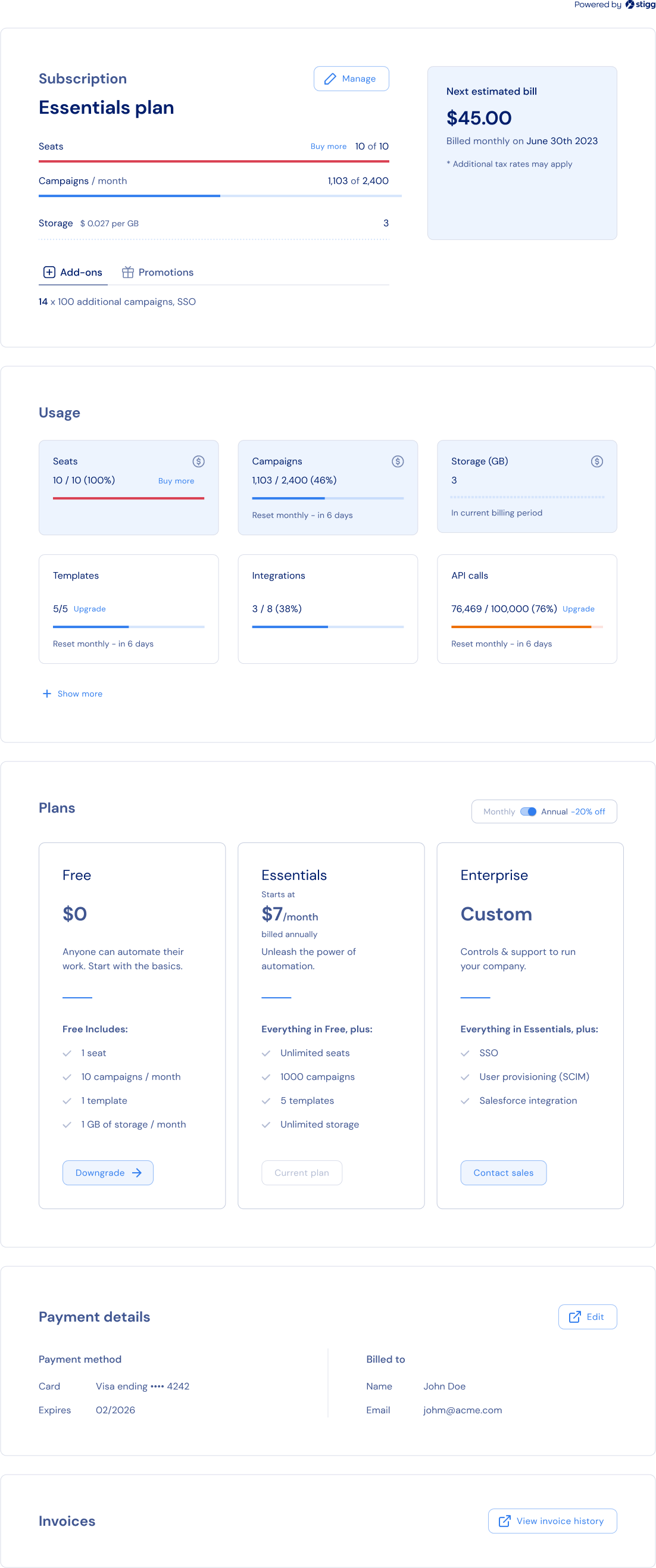
Stigg's customer portal widget allows you to introduce self-service and drive in-app expansions using only a few lines of codes.
The customer portal:
1. Provides customers with visibility to their current subscription details - subscribed plan, purchased add-ons, granted promotional entitlements.
2. Provides customers with visibility to the usage of their subscription's features.
3. Allows customers to upgrade and downgrade their subscription in a self-served manner - when you update your pricing model in Stigg, customers will auto-magically be able to upgrade or downgrade their subscription according to the updated pricing model 😎.
4. Allows customers to view their billing and payment information - when Stigg is integrated with a billing solution (such as Stripe), customers can also update this information and view previous invoices directly from the billing solution's billing portal.
 ## Customer portal sections
Stigg's customer portal widget is composed of the following sections.
### Subscription overview
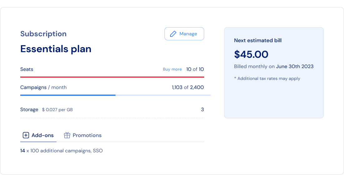
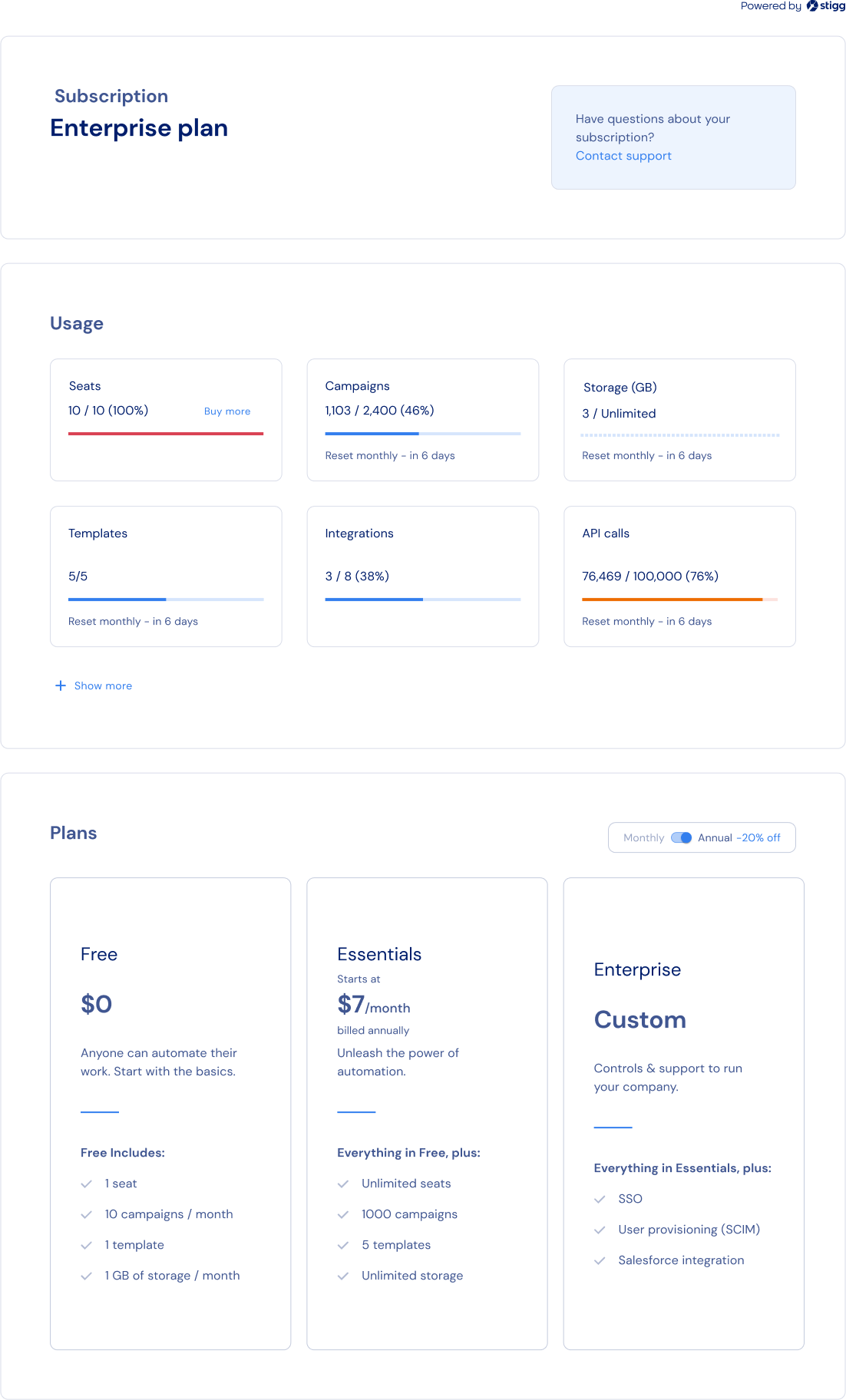
The Subscription Overview section provides customers with visibility to their current subscription details - subscribed plan, purchased add-ons, granted promotional entitlements.
## Customer portal sections
Stigg's customer portal widget is composed of the following sections.
### Subscription overview
The Subscription Overview section provides customers with visibility to their current subscription details - subscribed plan, purchased add-ons, granted promotional entitlements.
 ### Usage
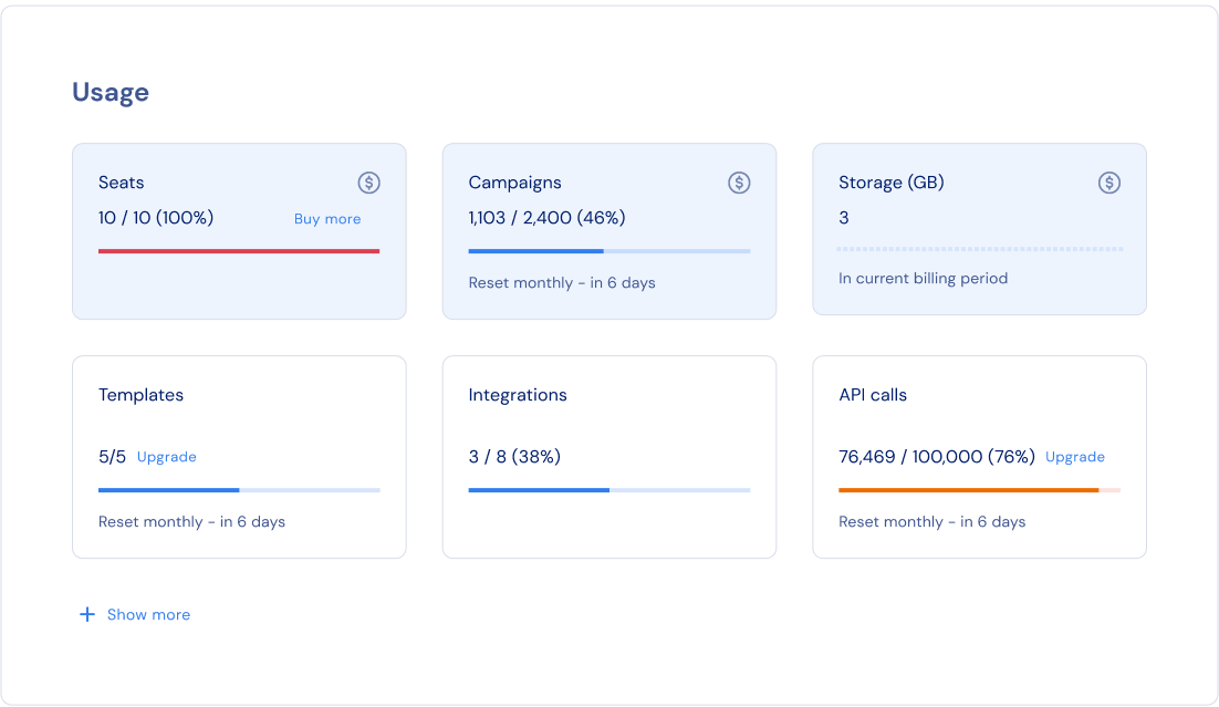
The Usage section provides customers with visibility to the usage of their subscription's features.
### Usage
The Usage section provides customers with visibility to the usage of their subscription's features.
 ### Plan picker
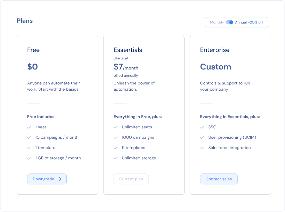
The Plan Picker section allows customers to upgrade and downgrade their subscription in a self-served manner.
When you update your pricing model in Stigg, customers will auto-magically be able to upgrade or downgrade their subscription according to the updated pricing model 😎.
Behind the scenes, this section leverages the [Stigg Pricing Table widget](./pricing-table).
### Plan picker
The Plan Picker section allows customers to upgrade and downgrade their subscription in a self-served manner.
When you update your pricing model in Stigg, customers will auto-magically be able to upgrade or downgrade their subscription according to the updated pricing model 😎.
Behind the scenes, this section leverages the [Stigg Pricing Table widget](./pricing-table).
 ### Payment details
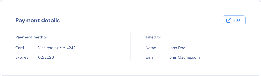
The Payment Details section allows customers to view their billing and payment information.
Customers that have a an active paid subscription can update their billing details (name, address) and payment method in the Stripe Billing Portal via link from the Stigg Customer Portal.
### Payment details
The Payment Details section allows customers to view their billing and payment information.
Customers that have a an active paid subscription can update their billing details (name, address) and payment method in the Stripe Billing Portal via link from the Stigg Customer Portal.
 1. Stigg must be integrated with [Stripe](../../documentation/native-integrations/billing/stripe/integration-when-using-stripe-elements-for-checkout)
2. To ensure that the functionality of Stigg's Customer Portal doesn't collide with Stripe's Billing Portal, ensure that [Stripe's Billing Portal is configured correctly](../../documentation/native-integrations/billing/stripe/integration-when-using-stripe-elements-for-checkout).
### Invoices
Customers that have a an active paid subscription or had one in the past can view past invoices in the Stripe Billing Portal via a link from the Stigg Customer Portal.
1. Stigg must be integrated with [Stripe](../../documentation/native-integrations/billing/stripe/integration-when-using-stripe-elements-for-checkout)
2. To ensure that the functionality of Stigg's Customer Portal doesn't collide with Stripe's Billing Portal, ensure that [Stripe's Billing Portal is configured correctly](../../documentation/native-integrations/billing/stripe/integration-when-using-stripe-elements-for-checkout).
### Invoices
Customers that have a an active paid subscription or had one in the past can view past invoices in the Stripe Billing Portal via a link from the Stigg Customer Portal.
 Stigg must be integrated with [Stripe](../../documentation/native-integrations/billing/stripe/integration-when-using-stripe-elements-for-checkout) to allow customers to view past invoices.
Visibility for invoices directly in the Stigg Customer Portal is on our roadmap.
When integrating Stigg widgets into your application, it's highly recommended to [enable client-side security enforcement](/api-and-sdks/integration/frontend/hardening-client-side-access), especially in production environments.
## Rendering a customer portal
To render customer portals inside your application, when a customer signs-in or restores their session set the customer ID:
```typescript React theme={null}
import { StiggProvider } from '@stigg/react-sdk';
export function App() {
return (
);
}
```
```typescript Vue.js theme={null}
```
Use the `CustomerPortal` component to render the customer portal.
The CustomerPortal component support [component composition](https://reactjs.org/docs/composition-vs-inheritance.html) so it's possible to pass as a parameter the Paywall component and it will be rendered inside the customer portal.
```typescript React theme={null}
}
theme={...}
textOverrides={...}
/>
```
```typescript Vue.js theme={null}
```
Learn more on how to [refresh Stigg cache](../../api-and-sdks/integration/frontend/react#refreshing-the-cache) after performing an operation that modifies the customer to immediately reflect the customer changes on the customer portal
## Widget modularity
The `CustomerPortal` component is just an opinionated way to render the customer portal in a specific layout which is based on our experience after reviewing many customer portals, but if you need more flexibility in how the customer portal is rendered, you can integrate directly each of its sections separately.
To do so, wrap all the section components with `CustomerPortalProvider` which will pass the necessary data to each component:
```javascript React theme={null}
import {
CustomerPortalProvider,
CustomerUsageData,
PaymentDetailsSection,
/* more components that can be used as standalone
SubscriptionsOverview,
AddonsList,
Promotions,
InvoicesSection
*/
} from '@stigg/react-sdk"
function App() {
return (
)
}
```
## Subscriptions with a custom price
Customers that are subscribed to a subscription with a custom price can't upgrade on downgrade their subscription in a self-served manner using the customer portal widget. Instead, you can handle the `onContactSupport` method to allow customers contact a sales or customer success representative that can do so on their behalf.
Stigg must be integrated with [Stripe](../../documentation/native-integrations/billing/stripe/integration-when-using-stripe-elements-for-checkout) to allow customers to view past invoices.
Visibility for invoices directly in the Stigg Customer Portal is on our roadmap.
When integrating Stigg widgets into your application, it's highly recommended to [enable client-side security enforcement](/api-and-sdks/integration/frontend/hardening-client-side-access), especially in production environments.
## Rendering a customer portal
To render customer portals inside your application, when a customer signs-in or restores their session set the customer ID:
```typescript React theme={null}
import { StiggProvider } from '@stigg/react-sdk';
export function App() {
return (
);
}
```
```typescript Vue.js theme={null}
```
Use the `CustomerPortal` component to render the customer portal.
The CustomerPortal component support [component composition](https://reactjs.org/docs/composition-vs-inheritance.html) so it's possible to pass as a parameter the Paywall component and it will be rendered inside the customer portal.
```typescript React theme={null}
}
theme={...}
textOverrides={...}
/>
```
```typescript Vue.js theme={null}
```
Learn more on how to [refresh Stigg cache](../../api-and-sdks/integration/frontend/react#refreshing-the-cache) after performing an operation that modifies the customer to immediately reflect the customer changes on the customer portal
## Widget modularity
The `CustomerPortal` component is just an opinionated way to render the customer portal in a specific layout which is based on our experience after reviewing many customer portals, but if you need more flexibility in how the customer portal is rendered, you can integrate directly each of its sections separately.
To do so, wrap all the section components with `CustomerPortalProvider` which will pass the necessary data to each component:
```javascript React theme={null}
import {
CustomerPortalProvider,
CustomerUsageData,
PaymentDetailsSection,
/* more components that can be used as standalone
SubscriptionsOverview,
AddonsList,
Promotions,
InvoicesSection
*/
} from '@stigg/react-sdk"
function App() {
return (
)
}
```
## Subscriptions with a custom price
Customers that are subscribed to a subscription with a custom price can't upgrade on downgrade their subscription in a self-served manner using the customer portal widget. Instead, you can handle the `onContactSupport` method to allow customers contact a sales or customer success representative that can do so on their behalf.
 ## Customization
### No-code widget designer
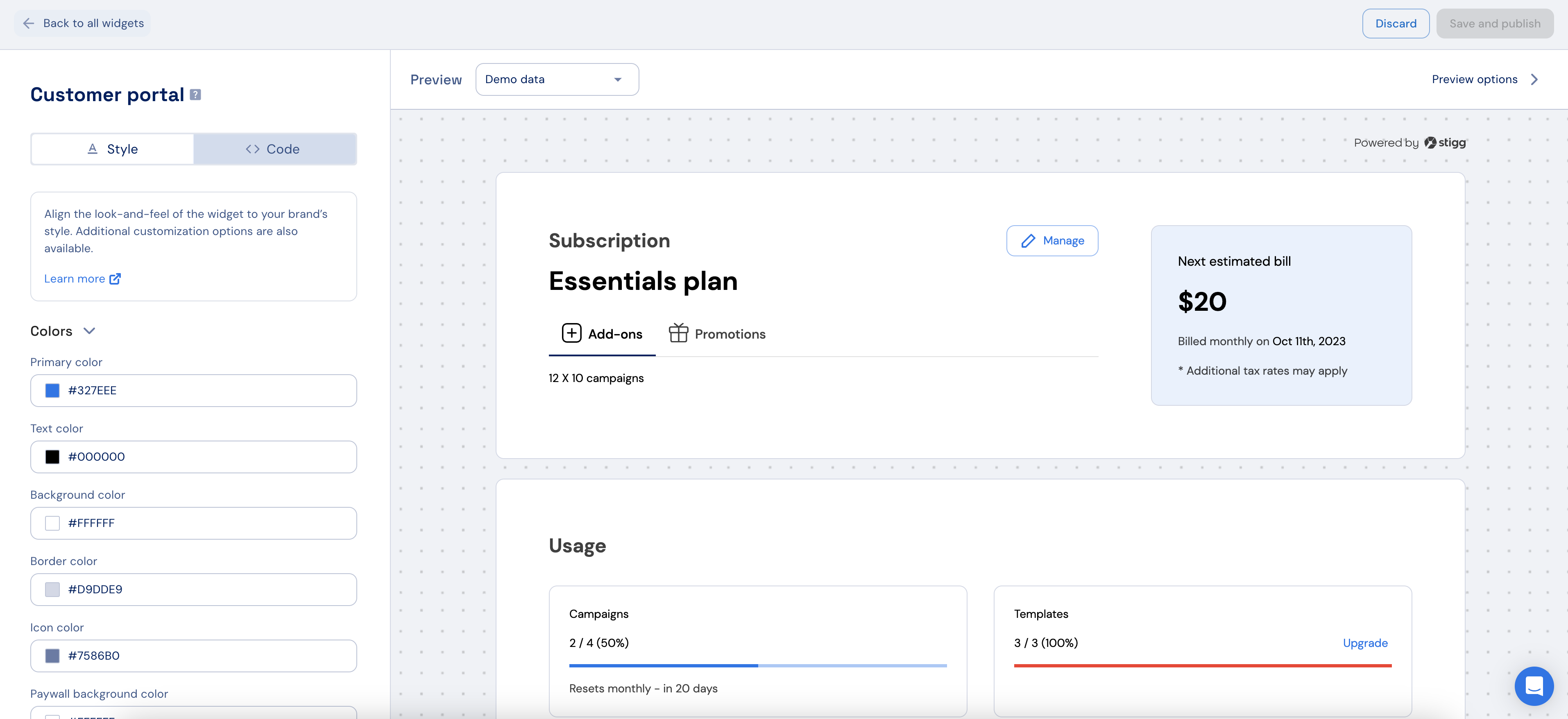
The Stigg app offers a no-code widget designer, which allows you to control the widget colors, typography and layout.
## Customization
### No-code widget designer
The Stigg app offers a no-code widget designer, which allows you to control the widget colors, typography and layout.
 ### Custom CSS
For more advanced customization, custom CSS can be applied using the widget designer of the Stigg app. Alternatively, custom CSS can also be applied using code.
Below you can find a list of the supported CSS classes:
| Class name | Description |
| ----------------------------------------- | --------------------------------------------------------------------- |
| stigg-payment-details-section-layout | Styles applied to billing information title |
| stigg-payment-details-section-header | Styles applied to payment details title layout |
| stigg-payment-details-section-title | Styles applied to payment details title |
| stigg-customer-name | Styles applied to payment details customer name |
| stigg-customer-email | Styles applied to payment details customer email |
| stigg-credit-card | Styles applied to payment details credit card |
| stigg-credit-card-expiration | Styles applied to payment details credit card expiration date |
| stigg-invoices-section-layout | Styles applied to invoice section layout |
| stigg-invoices-section-header | Styles applied to invoice section title layout |
| stigg-invoices-section-title | Styles applied to invoice section title |
| stigg-view-invoice-history-button | Styles applied to invoice history button |
| stigg-edit-payment-details-button | Styles applied to update payment details button |
| stigg-user-information-layout | Styles applied to user information |
| stigg-customer-portal-usage-section-title | Styles applied to the Usage section title |
| stigg-entitlement-usage-`{featureID}` | Styles applied to the feature usage according to their unique ID |
| stigg-`{plan.id}` | Styles applied to the plan container by its plan ID |
| stigg-compatible-addon-`{addon.id}` | Styles applied to a specific add-on row by its add-on ID |
| stigg-entitlement-feature-`{feature.id}` | Styles applied to a specific entitlement row by the feature ID (slug) |
`{feature.id}` is the feature’s slug (lowercase; spaces and special characters become `-`).\
This class is added **in addition to** `stigg-entitlement-row-container`, so you can safely target one entitlement without affecting others.\
Mirrors the existing patterns: `stigg-{plan.id}` (plan) and `stigg-compatible-addon-{addon.id}` (add-on).
In addition, since the Plans section of the customer portal can include the Stigg pricing table widget you can leverage [its CSS classes](../snap-in-widgets/pricing-table#custom-css) to customize its styling.
### Texts
The default widget texts can currently be overridden using code:
```javascript React theme={null}
const textOverrides = {
manageSubscription: 'Manage',
usageTabTitle: 'Usage',
addonsTabTitle: 'Add-ons',
promotionsTabTitle: 'Promotions',
promotionsSubtitle: 'You were granted access to additional functionality at no additional cost.',
contactSupportTitle: 'Have questions about your subscription?',
contactSupportLink: 'Contact support',
editBilling: 'Edit billing details',
invoicesTitle: 'Invoices',
viewInvoiceHistory: 'View invoice history',
editPaymentDetails: 'Edit',
paywallSectionTitle: 'Plans',
cancelScheduledUpdatesButtonTitle: 'Cancel update',
}
}
/>
```
```typescript Vue.js theme={null}
```
You can find more text overrides options [here](https://react-sdk-docs.stigg.io/types/customerportalprops)
## Additional resources
## Related SDKs
### Custom CSS
For more advanced customization, custom CSS can be applied using the widget designer of the Stigg app. Alternatively, custom CSS can also be applied using code.
Below you can find a list of the supported CSS classes:
| Class name | Description |
| ----------------------------------------- | --------------------------------------------------------------------- |
| stigg-payment-details-section-layout | Styles applied to billing information title |
| stigg-payment-details-section-header | Styles applied to payment details title layout |
| stigg-payment-details-section-title | Styles applied to payment details title |
| stigg-customer-name | Styles applied to payment details customer name |
| stigg-customer-email | Styles applied to payment details customer email |
| stigg-credit-card | Styles applied to payment details credit card |
| stigg-credit-card-expiration | Styles applied to payment details credit card expiration date |
| stigg-invoices-section-layout | Styles applied to invoice section layout |
| stigg-invoices-section-header | Styles applied to invoice section title layout |
| stigg-invoices-section-title | Styles applied to invoice section title |
| stigg-view-invoice-history-button | Styles applied to invoice history button |
| stigg-edit-payment-details-button | Styles applied to update payment details button |
| stigg-user-information-layout | Styles applied to user information |
| stigg-customer-portal-usage-section-title | Styles applied to the Usage section title |
| stigg-entitlement-usage-`{featureID}` | Styles applied to the feature usage according to their unique ID |
| stigg-`{plan.id}` | Styles applied to the plan container by its plan ID |
| stigg-compatible-addon-`{addon.id}` | Styles applied to a specific add-on row by its add-on ID |
| stigg-entitlement-feature-`{feature.id}` | Styles applied to a specific entitlement row by the feature ID (slug) |
`{feature.id}` is the feature’s slug (lowercase; spaces and special characters become `-`).\
This class is added **in addition to** `stigg-entitlement-row-container`, so you can safely target one entitlement without affecting others.\
Mirrors the existing patterns: `stigg-{plan.id}` (plan) and `stigg-compatible-addon-{addon.id}` (add-on).
In addition, since the Plans section of the customer portal can include the Stigg pricing table widget you can leverage [its CSS classes](../snap-in-widgets/pricing-table#custom-css) to customize its styling.
### Texts
The default widget texts can currently be overridden using code:
```javascript React theme={null}
const textOverrides = {
manageSubscription: 'Manage',
usageTabTitle: 'Usage',
addonsTabTitle: 'Add-ons',
promotionsTabTitle: 'Promotions',
promotionsSubtitle: 'You were granted access to additional functionality at no additional cost.',
contactSupportTitle: 'Have questions about your subscription?',
contactSupportLink: 'Contact support',
editBilling: 'Edit billing details',
invoicesTitle: 'Invoices',
viewInvoiceHistory: 'View invoice history',
editPaymentDetails: 'Edit',
paywallSectionTitle: 'Plans',
cancelScheduledUpdatesButtonTitle: 'Cancel update',
}
}
/>
```
```typescript Vue.js theme={null}
```
You can find more text overrides options [here](https://react-sdk-docs.stigg.io/types/customerportalprops)
## Additional resources
## Related SDKs
 React
React
 Vue.js
 Next.js
 Webflow, Wordpress, HTML