
> ## Documentation Index
> Fetch the complete documentation index at: https://docs.stigg.io/llms.txt
> Use this file to discover all available pages before exploring further.

# Credits utilization

## Overview

The **Credit Utilization widget** provides a simple snapshot of how many prepaid credits have been consumed relative to the total available. It gives customers an at-a-glance view of usage progress and remaining balance.

## Layout

The Credit utilization widget displays how much of a customer’s available credits have been used, combining numeric values with a progress bar to show consumption relative to the total allocation at a glance.

The layout includes the following elements:

* **Header**: displays credit utilization label.
* **Usage counter**: shows consumed vs. total credits (e.g., `1,250 / 6,000 AI Tokens`).
* **Remaining balance**: highlights credits still available.
* **Progress bar**: visual indicator of utilization across the total allocation.
* **Add credits button**: a CTA button for prompting customers to top up their balance.

This widget is especially useful for quickly checking consumption status without needing detailed breakdowns.

<img src="https://mintcdn.com/stigg/R8ldx2GNXX1cZgjS/images/credit-utilization.png?fit=max&auto=format&n=R8ldx2GNXX1cZgjS&q=85&s=c364229c3c3b4c7f9ccc84a88356a51f" alt="" width="2062" height="304" data-path="images/credit-utilization.png" />

## Add credits

The **Add credits** button is shown automatically when both of the following conditions are met:

* Credit top-ups are allowed for the customer's account.
* The customer's current plan includes add-ons that can grant additional credits.

When clicked, Stigg opens a checkout flow that allows the customer to purchase additional credits. The credit amount and pricing are determined by the billing model configured in the top-up add-on within the price wizard.
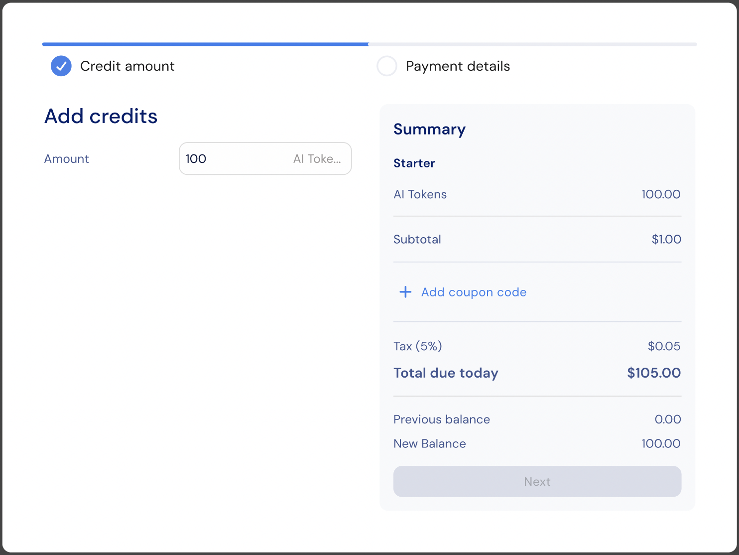
<img src="https://mintcdn.com/stigg/AQ59lzd1Y-8XWZuQ/images/add-credits-checkout.png?fit=max&auto=format&n=AQ59lzd1Y-8XWZuQ&q=85&s=ee1bbf1293bc46ca3a6c783d13d15737" alt="" width="1484" height="1114" data-path="images/add-credits-checkout.png" />

Use the `onAddCredits` prop to hook into the button click, for example to open a custom modal, trigger analytics, or redirect to a dedicated top-up page:

```jsx theme={null}
<CreditUtilization
  currencyId="cred-type-ai-tokens"
  onAddCredits={() => {
    // Custom behavior when "Add credits" is clicked
  }}
/>
```

## Customization

### No-code widget designer

The Stigg app offers a no-code widget designer, which allows you to control the widget colors, typography and layout.

### Custom CSS

For more advanced customization, custom CSS can be applied using the widget designer of the Stigg app. Alternatively, custom CSS can also be applied using code.

Below you can find a list of the supported CSS classes:

#### Main container classes

| Class name                                                                       | Description                                                   |
| -------------------------------------------------------------------------------- | ------------------------------------------------------------- |
| <span style={{whiteSpace: "nowrap"}}>`stigg-credit-utilization-container`</span> | Main wrapper container for the **CreditUtilization** widget   |
| <span style={{whiteSpace: "nowrap"}}>`stigg-credit-utilization-card`</span>      | Card container with border and padding that wraps the content |

#### Content classes

| Class name                                                                   | Description                                   |
| ---------------------------------------------------------------------------- | --------------------------------------------- |
| <span style={{whiteSpace: "nowrap"}}>`stigg-credit-utilization-title`</span> | Title or header text at the top of the widget |

#### Utilization display classes

| Class name                                                                             | Description                                         |
| -------------------------------------------------------------------------------------- | --------------------------------------------------- |
| <span style={{whiteSpace: "nowrap"}}>`stigg-credit-utilization-usage`</span>           | Consumed or used amount (left side of the fraction) |
| <span style={{whiteSpace: "nowrap"}}>`stigg-credit-utilization-separator`</span>       | Separator between used and total values (`/`)       |
| <span style={{whiteSpace: "nowrap"}}>`stigg-credit-utilization-total`</span>           | Total granted amount (right side of the fraction)   |
| <span style={{whiteSpace: "nowrap"}}>`stigg-credit-utilization-suffix`</span>          | Units or symbol text shown next to the fraction     |
| <span style={{whiteSpace: "nowrap"}}>`stigg-credit-utilization-remaining-label`</span> | **Remaining** label text                            |
| <span style={{whiteSpace: "nowrap"}}>`stigg-credit-utilization-remaining-value`</span> | Remaining balance amount                            |

#### Progress bar classes

| Class name                                                                      | Description                                        |
| ------------------------------------------------------------------------------- | -------------------------------------------------- |
| <span style={{whiteSpace: "nowrap"}}>`stigg-credit-utilization-progress`</span> | Progress bar showing credit utilization percentage |

#### CTA button classes

| Class name                                                                                | Description                            |
| ----------------------------------------------------------------------------------------- | -------------------------------------- |
| <span style={{whiteSpace: "nowrap"}}>`stigg-credit-utilization-add-credits-button`</span> | **Add credits** CTA button             |
| <span style={{whiteSpace: "nowrap"}}>`stigg-credit-utilization-add-credits-icon`</span>   | Icon inside the **Add credits** button |

#### State classes

| Class name                                                                              | Description                                     |
| --------------------------------------------------------------------------------------- | ----------------------------------------------- |
| <span style={{whiteSpace: "nowrap"}}>`stigg-credit-utilization-value-error`</span>      | Error message when balance fails to load        |
| <span style={{whiteSpace: "nowrap"}}>`stigg-credit-utilization-value-loading`</span>    | Loading skeleton state                          |
| <span style={{whiteSpace: "nowrap"}}>`stigg-credit-utilization-value-no-balance`</span> | Message shown when no balance data is available |

## Snippet

```jsx theme={null}
import React from 'react';
import { StiggProvider, CreditUtilization } from '@stigg/react-sdk';

function App() {
  return (
    <StiggProvider
      apiKey="your-stigg-api-key"
      customerId="customer-demo-01"
    >
      <div className="credit-widgets">
        {/* Credit Utilization with Progress Bar */}
        <CreditUtilization
          currencyId="cred-type-ai-tokens" // Required: currency identifier
          showUnits={true} // Optional: show units text
          decimalPlaces={0} // Optional: no decimals for whole numbers
          localization={{
            title: "Credit Usage", // Optional: custom title
            remaining: "Available" // Optional: custom remaining label
          }}
          onAddCredits={() => {
            // Optional: callback invoked when the "Add credits" button is clicked
            // The button is displayed when top-ups are allowed and
            // the plan has add-ons that can grant additional credits
          }}
        />
      </div>
    </StiggProvider>
  );
}

export default App;
```

### Props

<ParamField body="currencyId" type="string" required>
  Currency or credit type identifier used to fetch credit utilization data.
</ParamField>

<ParamField body="decimalPlaces" type="number">
  Number of decimal places to display for numeric values. Defaults to no limit when not set.
</ParamField>

<ParamField body="showUnits" type="boolean">
  Whether to display the currency unit label (for example, `"tokens"` or `"credits"`).
</ParamField>

<ParamField body="onAddCredits" type="(entitlement: CreditEntitlement) => void">
  Callback invoked when the **Add credits** button is clicked. Receives the current `CreditEntitlement` object. Use this to open a checkout flow, a modal, or redirect the customer to a top-up page.
</ParamField>

<ParamField body="localization" type="object">
  Text overrides for customizing widget labels and state messages.
</ParamField>

### Texts

The default widget texts can currently be overridden using code:

<CodeGroup>
  ```tsx React theme={null}
  import { CreditUtilization } from "@stigg/react-sdk";

  // Basic usage
  export function CustomerCreditUtilization() {
    return (
      <CreditUtilization
        currencyId="<CURRENCY_ID>"
        localization={{
          title: "Credit utilization",
          remainingLabel: "Remaining",
          loadingState: "Loading credit utilization...",
          errorState: "Failed to load credit utilization",
          noBalanceState: "No credit balance available",
        }}
      />
    );
  }

  ```

  ```bash bash theme={null}
  <script setup lang="ts">
  import { CreditUtilization, type CreditUtilizationProps } from "@stigg/vue-sdk";

  const creditUtilization: CreditUtilizationProps = {
    currencyId: "<CURRENCY_ID>",
    localization: {
      title: "Credit utilization",
      remainingLabel: "Remaining",
      loadingState: "Loading credit utilization...",
      errorState: "Failed to load credit utilization",
      noBalanceState: "No credit balance available",
    },
  };
  </script>

  <template>
    <CreditUtilization v-bind="creditUtilization" />
  </template>

  ```
</CodeGroup>

<Note>
  You can find additional text override options [here](https://react-sdk-docs.stigg.io/types/creditutilizationlocalization)
</Note>

## Additional resources

<Card title="Credit Utilization Localization" icon="palette" href="https://react-sdk-docs.stigg.io/types/creditutilizationlocalization" horizontal />

## Related SDKs

<CardGroup cols={2}>
  <Card title="" href="/api-and-sdks/integration/frontend/react" horizontal>
    <div style={{ display: 'flex', alignItems: 'center', gap: '12px' }}>
      <img src="https://mintcdn.com/stigg/FZ_ywutvYHnQbKpn/images/react.svg?fit=max&auto=format&n=FZ_ywutvYHnQbKpn&q=85&s=75e8661a7d87b8e2b3493d7fdfb33db9" alt="React" style={{ width: '32px' }} width="23" height="20" data-path="images/react.svg" />

      <span>React</span>
    </div>
  </Card>

  <Card title="" href="/api-and-sdks/integration/frontend/vuejs" horizontal>
    <div style={{ display: 'flex', alignItems: 'center', gap: '12px' }}>
      <img src="https://mintcdn.com/stigg/qpsRT7dNo0hXTxnb/images/vue.svg?fit=max&auto=format&n=qpsRT7dNo0hXTxnb&q=85&s=c861442fd84f9822a716d778b10a8dba" alt="Vue.js" style={{ width: '32px' }} width="800" height="800" data-path="images/vue.svg" />

      <span>Vue.js</span>
    </div>
  </Card>

  <Card title="" href="/api-and-sdks/integration/frontend/nextjs" horizontal>
    <div style={{ display: 'flex', alignItems: 'center', gap: '12px' }}>
      <img src="https://mintcdn.com/stigg/FZ_ywutvYHnQbKpn/images/next.svg?fit=max&auto=format&n=FZ_ywutvYHnQbKpn&q=85&s=7fea95b3e8f678015cb8b8d58d1e7886" alt="Next.js" style={{ width: '32px' }} width="16" height="16" data-path="images/next.svg" />

      <span>Next.js</span>
    </div>
  </Card>

  <Card title="" href="/api-and-sdks/integration/frontend/html" horizontal>
    <div style={{ display: 'flex', alignItems: 'center', gap: '12px' }}>
      <img src="https://mintcdn.com/stigg/aJeGPh9dwMpK_Kcr/images/html.svg?fit=max&auto=format&n=aJeGPh9dwMpK_Kcr&q=85&s=ae948dc9e5ca66cf75892b94859954a0" alt="Webflow, Wordpress, HTML" style={{ width: '32px' }} width="800" height="800" data-path="images/html.svg" />

      <span>Webflow, Wordpress, HTML</span>
    </div>
  </Card>
</CardGroup>
