> ## Documentation Index
> Fetch the complete documentation index at: https://docs.stigg.io/llms.txt
> Use this file to discover all available pages before exploring further.
# Credits usage chart
## Overview
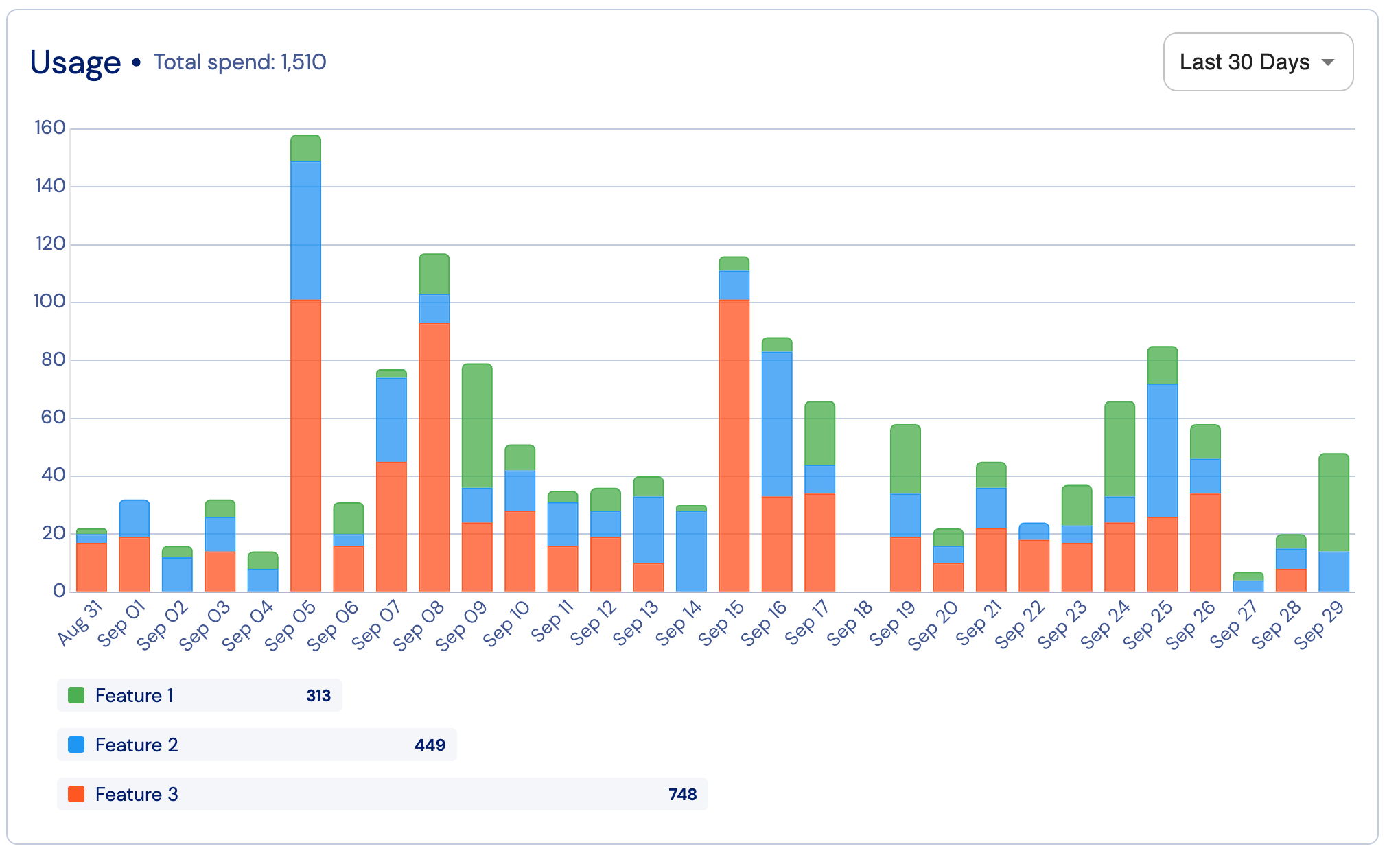
The **Credit Usage Chart widget** provides a visual breakdown of how credits are consumed over time. It helps customers understand their spending patterns and identify which features or services drive the most usage.
## Layout
The Usage widget displays usage over time in a stacked bar chart, providing a clear view of total spend and feature-level consumption for the selected period.
The layout includes the following elements:
* **Stacked bar chart**: shows daily credit consumption across different features or services.
* **Color-coded legend**: distinguishes usage by feature (e.g., Feature 1, Feature 2, Feature 3).
* **Total spend**: aggregate credits consumed over the selected timeframe.
* **Date range selector**: allows filtering usage data (e.g., last 7 days, last 30 days).
This widget is especially useful for monitoring consumption trends, analyzing feature-level usage, and forecasting future credit needs.
 ## Customization
### No-code widget designer
The Stigg app offers a no-code widget designer, which allows you to control the widget colors, typography and layout.
### Custom CSS
For more advanced customization, custom CSS can be applied using the widget designer of the Stigg app. Alternatively, custom CSS can also be applied using code.
Below you can find a list of the supported CSS classes:
#### Main component
| Class name | Description |
| -------------------------------------------------------------------------------- | ------------------------------------------------------------ |
| `stigg-credit-usage-chart-container` | Main wrapper for the entire **CreditUsageChart** component |
| `stigg-credit-usage-chart-card` | Card container that holds the chart layout and styling |
| `stigg-credit-usage-chart-skeleton` | Loading skeleton displayed while usage data is being fetched |
| `stigg-credit-usage-chart-bar` | Bar element used in the usage visualization |
#### Header component
| Class name | Description |
| ---------------------------------------------------------------------------------------- | ---------------------------------------------- |
| `stigg-credit-usage-chart-header` | Header container at the top of the chart |
| `stigg-credit-usage-chart-title` | Chart title text |
| `stigg-credit-usage-chart-total` | Displays the total spend or usage amount |
| `stigg-credit-usage-chart-time-range-select` | Selector used to change the chart’s time range |
#### Tooltip component
| Class name | Description |
| ------------------------------------------------------------------------------ | ---------------------------------------------- |
| `stigg-credit-usage-chart-tooltip` | Tooltip showing detailed usage values on hover |
#### Legend component
| Class name | Description |
| -------------------------------------------------------------------------------------------------- | --------------------------------------------------------------- |
| `stigg-credit-usage-chart-legend` | Wrapper for the entire legend section |
| `stigg-credit-usage-chart-legend-title` | Title for the legend block |
| `stigg-credit-usage-chart-legend-title-currency-units` | Currency or unit label in the legend header |
| `stigg-credit-usage-chart-legend-item` | Base class for each legend row |
| `stigg-credit-usage-chart-legend-item-{featureId}` | Feature-specific legend item class (`{featureId}` = feature ID) |
| `stigg-credit-usage-chart-legend-bar-container` | Container holding the color bar for each feature |
| `stigg-credit-usage-chart-legend-feature-name` | Wrapper for the feature name in the legend |
| `stigg-credit-usage-chart-legend-feature-name-text` | Text label displaying the feature name |
| `stigg-credit-usage-chart-legend-value` | Usage amount displayed for each feature |
#### Empty state component
| Class name | Description |
| ---------------------------------------------------------------------------------- | ----------------------------------------- |
| `stigg-credit-usage-chart-empty-state` | Displayed when no usage data is available |
#### Error state component
| Class name | Description |
| ---------------------------------------------------------------------------------- | ----------------------------------------------- |
| `stigg-credit-usage-chart-error-state` | Shown when the chart fails to load due to error |
## Snippet
```jsx theme={null}
import React from 'react';
import { StiggProvider, CreditUsageChart, CreditUsageTimeRange } from '@stigg/react-sdk';
function App() {
return (
## Customization
### No-code widget designer
The Stigg app offers a no-code widget designer, which allows you to control the widget colors, typography and layout.
### Custom CSS
For more advanced customization, custom CSS can be applied using the widget designer of the Stigg app. Alternatively, custom CSS can also be applied using code.
Below you can find a list of the supported CSS classes:
#### Main component
| Class name | Description |
| -------------------------------------------------------------------------------- | ------------------------------------------------------------ |
| `stigg-credit-usage-chart-container` | Main wrapper for the entire **CreditUsageChart** component |
| `stigg-credit-usage-chart-card` | Card container that holds the chart layout and styling |
| `stigg-credit-usage-chart-skeleton` | Loading skeleton displayed while usage data is being fetched |
| `stigg-credit-usage-chart-bar` | Bar element used in the usage visualization |
#### Header component
| Class name | Description |
| ---------------------------------------------------------------------------------------- | ---------------------------------------------- |
| `stigg-credit-usage-chart-header` | Header container at the top of the chart |
| `stigg-credit-usage-chart-title` | Chart title text |
| `stigg-credit-usage-chart-total` | Displays the total spend or usage amount |
| `stigg-credit-usage-chart-time-range-select` | Selector used to change the chart’s time range |
#### Tooltip component
| Class name | Description |
| ------------------------------------------------------------------------------ | ---------------------------------------------- |
| `stigg-credit-usage-chart-tooltip` | Tooltip showing detailed usage values on hover |
#### Legend component
| Class name | Description |
| -------------------------------------------------------------------------------------------------- | --------------------------------------------------------------- |
| `stigg-credit-usage-chart-legend` | Wrapper for the entire legend section |
| `stigg-credit-usage-chart-legend-title` | Title for the legend block |
| `stigg-credit-usage-chart-legend-title-currency-units` | Currency or unit label in the legend header |
| `stigg-credit-usage-chart-legend-item` | Base class for each legend row |
| `stigg-credit-usage-chart-legend-item-{featureId}` | Feature-specific legend item class (`{featureId}` = feature ID) |
| `stigg-credit-usage-chart-legend-bar-container` | Container holding the color bar for each feature |
| `stigg-credit-usage-chart-legend-feature-name` | Wrapper for the feature name in the legend |
| `stigg-credit-usage-chart-legend-feature-name-text` | Text label displaying the feature name |
| `stigg-credit-usage-chart-legend-value` | Usage amount displayed for each feature |
#### Empty state component
| Class name | Description |
| ---------------------------------------------------------------------------------- | ----------------------------------------- |
| `stigg-credit-usage-chart-empty-state` | Displayed when no usage data is available |
#### Error state component
| Class name | Description |
| ---------------------------------------------------------------------------------- | ----------------------------------------------- |
| `stigg-credit-usage-chart-error-state` | Shown when the chart fails to load due to error |
## Snippet
```jsx theme={null}
import React from 'react';
import { StiggProvider, CreditUsageChart, CreditUsageTimeRange } from '@stigg/react-sdk';
function App() {
return (
);
}
export default App;
```
## Additional resources
## Related SDKs
 React
React
 Vue.js
 Next.js
 Webflow, Wordpress, HTML